Welcome, Scott!

I was one of several illustrators who had been doing freelance work for Angie’s literacy website, HappyReading.org. Angie and I worked very well together from the beginning, and when she was ready to publish SHORT PUMP BUMP!, she made a point of reaching out to me to see if I was interested. She knows plenty of talented illustrators, so I was really quite honored.
Tell us about your process for creating the illustrations for SHORT PUMP BUMP!
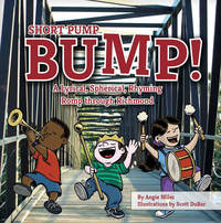
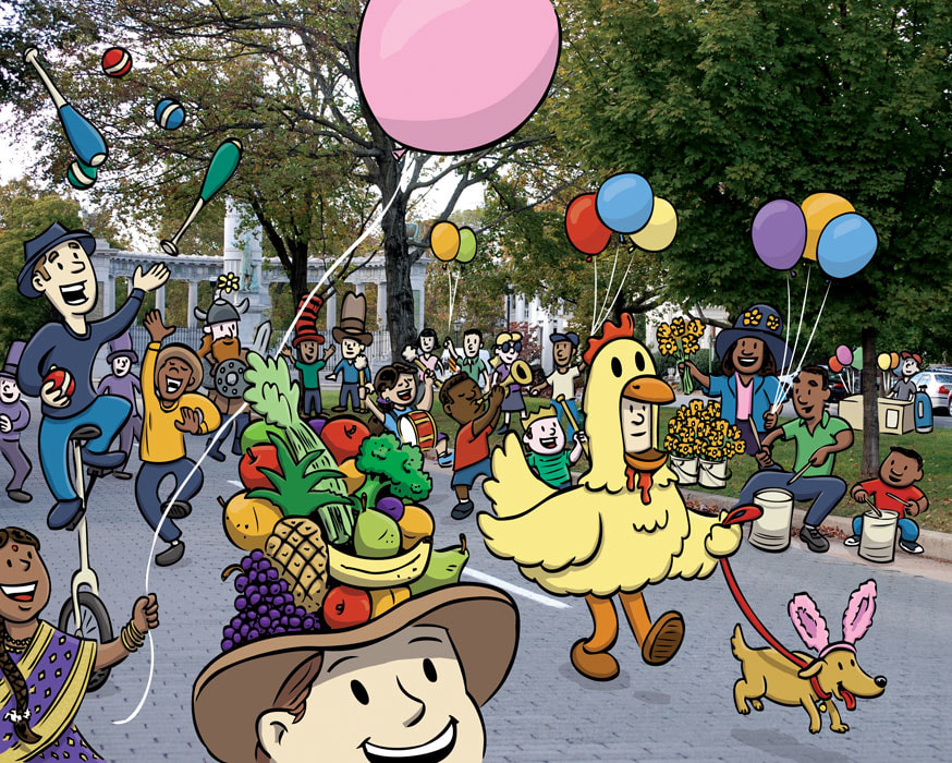
Angie’s idea was to use photographs for most of the locations she wanted to feature in SHORT PUMP BUMP!, and for me to place illustrated characters in each scene. I opened her pictures in Adobe Photoshop where I was able to sketch the characters on a separate layer, similar to placing tracing paper over a printed photo and drawing on that. (I guess I should mention I use a digital drawing tablet from Wacom that allows me to draw directly in Photoshop.) Working digitally like this was a huge help, making it much easier to have the characters convincingly interact with elements in the photo. For example, one of Angie's poems needed to have characters not just walking down Monument Avenue, but also sitting on the curb or standing behind trees. Being able to work digitally helped me to keep the characters aligned perfectly with the photo during each stage of my illustration process.
Once Angie approved a sketch, I printed a composite with the photo and traced my characters onto art paper using a Huion LED light board. Then I went over the new pencil drawing in ink using a crowquill pen. This process of working both digitally and traditionally is referred to as a hybrid workflow. Personally, I prefer working this way as I feel I have more control over my line-work using traditional art tools rather than drawing entirely digitally. After the inking is done, I scan my artwork and bring it into Photoshop where I place it on a layer above the photo, using my original sketch as a guide. The final stage is to add color, which is so much fun to do digitally. I love having the freedom to experiment with different color combinations quickly and easily. I can also easily make subtle adjustments to help balance out the colors of my artwork with the colors of the photo, which helps the characters fit into the scene better. And the best part is no messy brushes or palette to clean up afterwards!
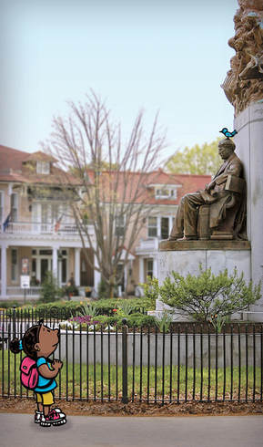
Many of the location photos I had to work with presented difficulties in terms of being able to easily place my characters the way I wanted. Angie took lots of pictures so I had multiple angles for each of the locations, but I still often found myself wishing I could somehow slightly change the angle or lighting of the photo in ways that even Photoshop can’t pull off. In the end, it was simply a matter of me pushing my ideas a little bit differently; working with the photograph, not against it.
The only unexpected surprise I can think of has to do with the illustration I did of Angie and me for the back of the book. When I first sent the final artwork, Angie asked if I could make an adjustment to her skin tone as she felt what I had done was a slightly off. She had sent me several photos of herself which I used for reference, so I was at a bit of a loss for what to do. In Photoshop, I can lift the color from any image and draw or paint with that color, which I had already done using the reference photos she sent. In fairness to Angie, she did acknowledge that the photos weren’t truly accurate representations of her skin tone in real life. We went back and forth a few times before she told me something like “I’m more caramel than mocha.” The “unexpected surprise” part of this story came when, out of desperation, I used a color sample of a picture of caramel I found online without telling her what I did. When she saw it, she said “That’s it! You got it!”
I feel great joy of seeing something I spent several years working on in print and being read by kids and parents. I have to also say that I am really pleased with the job Belle Isle Books did on the design and layout. The colors they chose complement my artwork so well, and they did a nice job repurposing some of my characters for the non-numbered pages of the book. But my personal favorite was the way the title shows the “M” in Bump kind of jumping. (I’m a sucker for playful typography!)
Our initial launch was just before the winter holidays, so I have personally only had the chance so far to share the book with my family and close friends. I also set up my very first online shop on my website where people can buy signed copies of SHORT PUMP BUMP!, along with art prints and greeting cards. Angie has already done several school and library events, and we have plans on making joint appearances down the road. In the meantime, my first public event will be doing book signings at the SCBWI MD/DE/WV Annual Conference in Maryland this March, so I’m pretty excited about that.
